ShopDreamUp AI ArtDreamUp
SummerDreams-Art has limited the viewing of this artwork to members of the DeviantArt community only.
You can log in or become a member for FREE.
Deviation Actions


Description
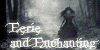
This is my entry for the White on White contest 
UPDATE: 2nd place in Level 3 for the White on White contest
Stocks used:
Model: mizzd-stock.deviantart.com/art…
Background: anakmoon.deviantart.com/art/Pr…
Lake: burtn.deviantart.com/art/Dark-…
Swans: rinymph-stock.deviantart.com/a… & rinymph-stock.deviantart.com/a…
Leopard: evelivesey.deviantart.com/art/…
Owl: elevit-stock.deviantart.com/ar…
Trees: brokenwing3dstock.deviantart.c… & zememz.deviantart.com/art/3D-T…
Ripples: superlibbie.deviantart.com/art…
Brushes: redheadstock.deviantart.com/ar…
Textures: frozenstarro.deviantart.com/ar… & frostbo.deviantart.com/art/Tex…
Thanks to all those who & appreciate my work!
 (Smile)")
Stocks used:
Model: mizzd-stock.deviantart.com/art…
Background: anakmoon.deviantart.com/art/Pr…
Lake: burtn.deviantart.com/art/Dark-…
Swans: rinymph-stock.deviantart.com/a… & rinymph-stock.deviantart.com/a…
Leopard: evelivesey.deviantart.com/art/…
Owl: elevit-stock.deviantart.com/ar…
Trees: brokenwing3dstock.deviantart.c… & zememz.deviantart.com/art/3D-T…
Ripples: superlibbie.deviantart.com/art…
Brushes: redheadstock.deviantart.com/ar…
Textures: frozenstarro.deviantart.com/ar… & frostbo.deviantart.com/art/Tex…
Thanks to all those who
Image size
2720x2550px 4.14 MB
Make
Canon
Model
Canon PowerShot A630
Shutter Speed
1/60 second
Aperture
F/2.8
Focal Length
7 mm
Date Taken
Jun 13, 2008, 6:30:08 PM
Sensor Size
7mm
© 2013 - 2024 SummerDreams-Art
Comments58
Join the community to add your comment. Already a deviant? Log In
Very nicely composed. Your queen follows the rule of third exactly making the entire composition very pleasing to the eye. The stock you've chosen works well together.
For this composition to really work well, there should be a greater sense of depth. From the relative sizes, the queen is in the foreground, the branch may be in the foreground with the queen or one step back, there are 2 swans in the middle foreground, another swan and some trees in the middle background, and a castle in the far background. However, each item is sharply detailed, which might indicate that they all are on the same plane. I would suggest lightening the background and making it much more indistinct. (use the gaussin blur filter at a low setting - play around with it until you find a reasonable amount of blur to indicate the difference suggested by the size of the model and the relative size of the castle. The same would be true of the swans. The furthest swan should be slightly blurred, the two middle-foreground swans need to have their edges blurred. Too crisp against the dark background of the stream. Also, rather than drop shadow, since the swans are on water (a reflective surface) you should really put both a shadow AND a reflection. Reflections are easy - copy your layer, invert it, reduce opacity, and use a layer mask on the bottom part.
The shadows are appropriate. I might quibble that the cat should have a slight bit more shadow (very light) between the paws. You might try lightening the entire image a couple of shades to better fit the White on White - this is a bit more white on blue. You can always do an adjustment layer in B&W and reduce the opacity.
You've done an excellent job in matching the viewpoints of all three characters - not an easy task! Hehe - even a couple of the swans seem interested in the flight of the owl!) You've done a lovely job of incorporating the stocks to produce a lovely image.